FINTECH / MOBILE
Banking App
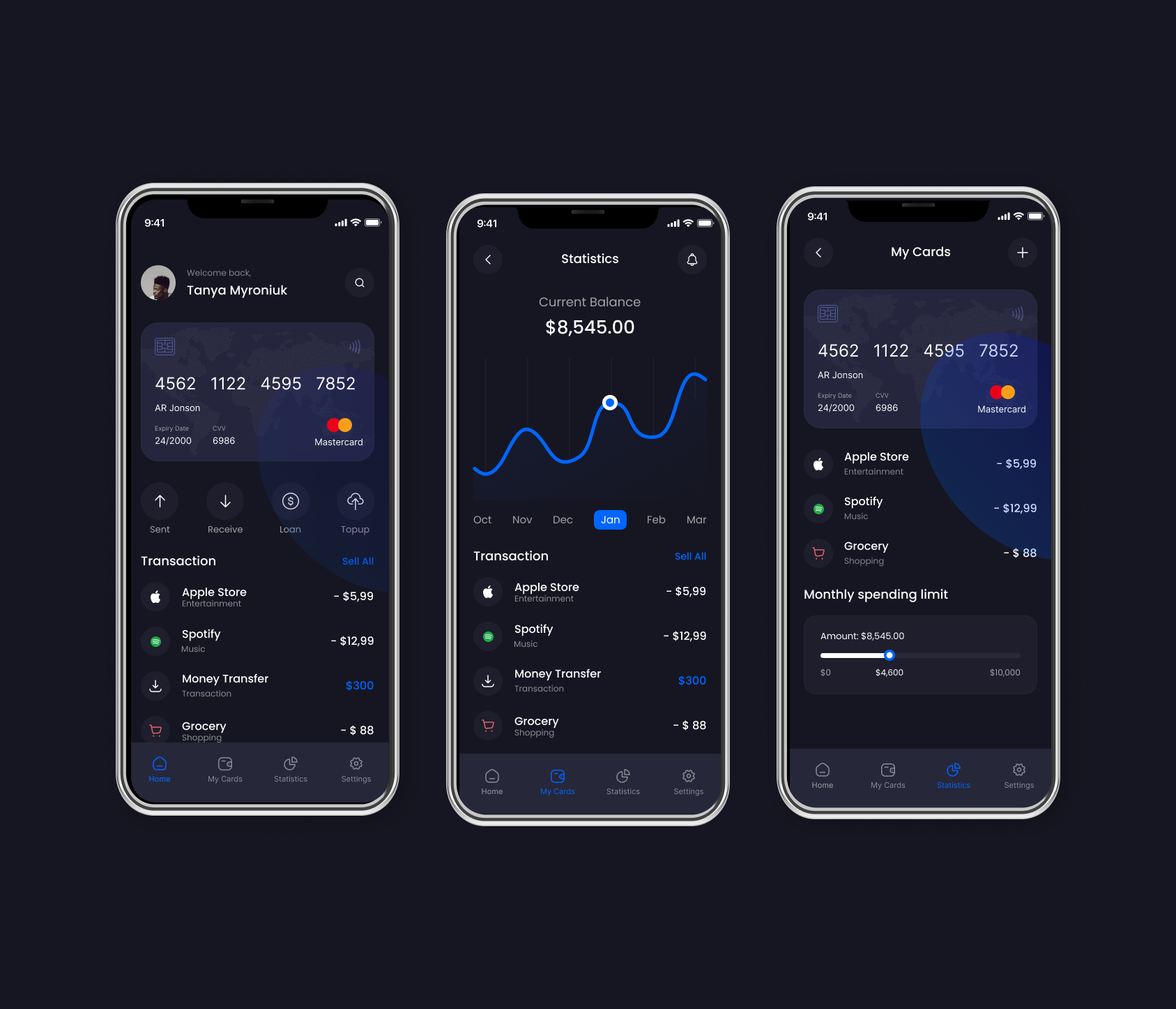
FINTECH / MOBILE
THE PROBLEM
Users couldn't tell at a glance where their money was actually going each month.
THE SOLUTION
A card-first home screen with a spending-limit visual users can read and understand in under 3 seconds.
THE SCREENS
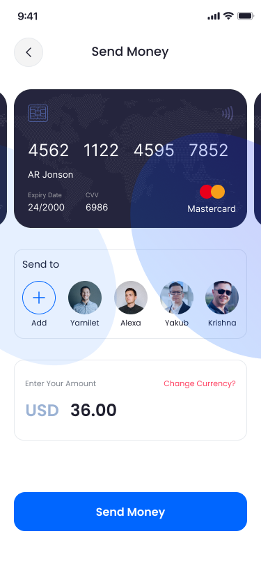
HOME & BALANCE
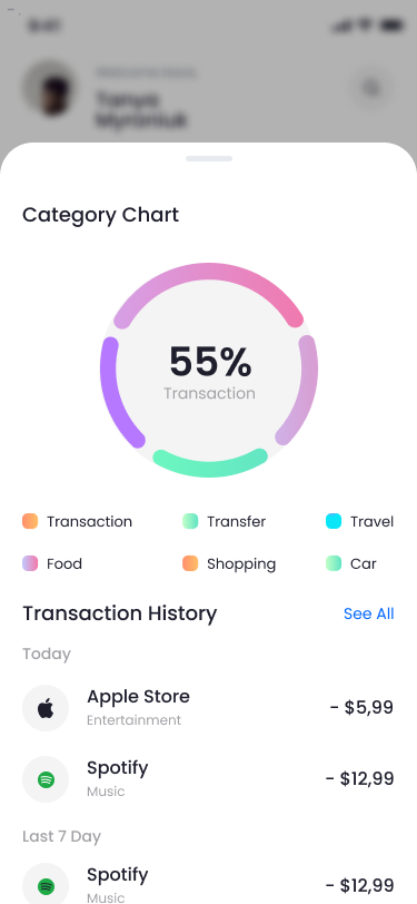
STATISTICS
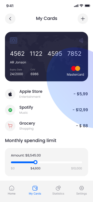
MY CARDS
THE RESULTS
+22%
Weekly App Opens
-18%
Support Tickets