MOBILE APP DESIGN · UI/UX Design · 3 weeks · Figma
StaySafe — Ride Booking App
Mazain Solution — Senior UI/UX Designer & Design Team Lead, Abdulwahab Khan.
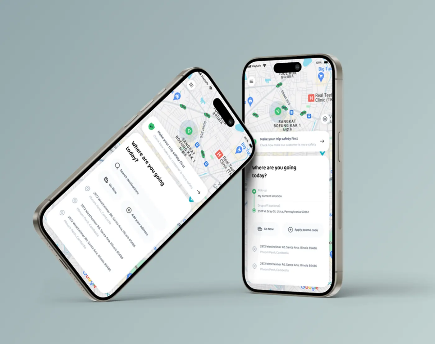
The problem
Riders were reaching the final booking step before seeing the fare and safety details, which created hesitation and drop-off right at checkout.
The solution
I moved fare and safety information to the first screens instead of the last, so riders commit with the full picture and booking feels safe from the first tap.
The research
- Mapped the full ride-booking journey end to end
- Benchmarked ride-hailing apps for pricing clarity and safety features
- Reviewed thumb-reach and one-handed use on common phone sizes
- Fare certainty arrived too late in the flow
- Safety features were buried in menus rather than visible in the ride
- Booking steps added hesitation when the destination was already chosen
Key insight: Trust in a ride app is built by showing price and safety before the rider has to commit.
My process
Flow Mapping
Mapped the full ride-booking journey end-to-end to spot steps that added hesitation.
Mobile Wireframes
Prioritized thumb-reach and one-handed use across every core screen.
Visual & Motion Design
Designed a mobile-first UI kit with clear states for booking, tracking and safety features.
Prototype & Review
Prototyped the booking, ride selection and driver-connection states with motion in Figma and reviewed the flow with the Mazain Solution product team.
Design-to-Code Handoff
Annotated Figma files with interaction specs, motion timings and state coverage handed to the Mazain Solution developers.
Key design decisions
- Fare and safety up front — Removes the surprise that caused abandonment.
- Thumb-zone controls — Primary actions sit in the bottom half for one-handed use.
- Distinct states for connecting and tracking — Reduces anxiety while the rider waits for a driver.
The screens
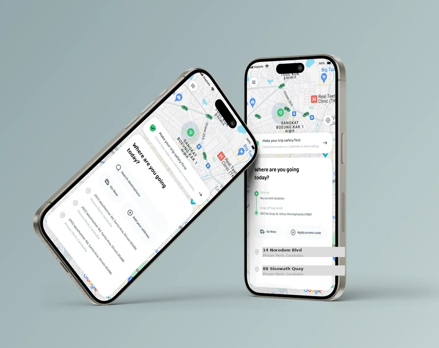 WHERE TO SCREEN
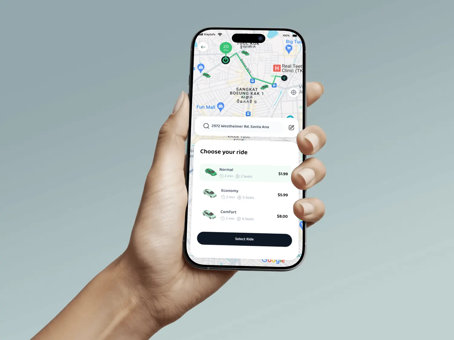 CHOOSE YOUR RIDE
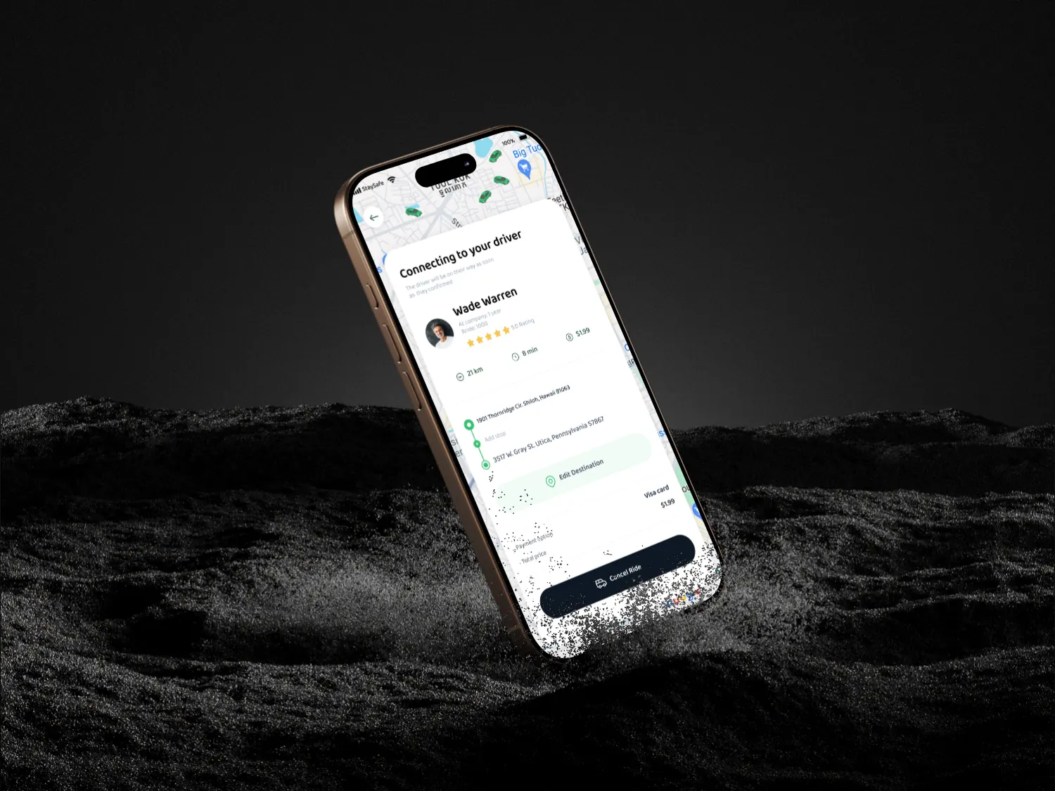 CONNECTING TO DRIVER
Results
- 50%+ — Increase in Booking Completion