WEBSITE DESIGN · UI/UX Design · Desktop · Figma
Vantera — Business Website
Internship Project — Product Design Intern, Abdulwahab Khan.
The problem
A performance-marketing agency needed a homepage that proves results immediately instead of listing services.
The solution
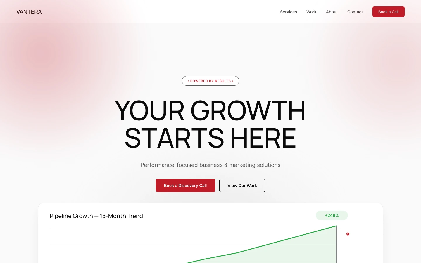
I designed a clean, proof-first homepage: a growth chart hero, services, process, featured case study, FAQ and a clear discovery-call CTA, explored in two accent directions (red and green).
The research
- Reviewed performance-marketing agency sites for how they show proof
- Listed the questions a prospect asks before booking a discovery call
- Explored two accent directions with the client
- Most agency sites list services without proof
- Case studies are buried below generic copy
- A single clear call to action converts better than several
Key insight: An agency sells results, so the homepage should show them in the first viewport.
My process
Positioning
Led with a measurable growth chart so the value is clear before any copy is read.
Structure
Ordered the page: services, process, featured case study, work, why us, FAQ, CTA.
Visual System
Neutral canvas with soft gradient blobs and one accent colour for actions.
Variants
Delivered red and green accent directions for the client to choose from.
Prototype & Review
Prototyped the full homepage and both accent directions so the client could compare them in context.
Design-to-Code Handoff
Delivered red and green variants from one system with colour tokens, section specs and spacing notes.
Key design decisions
- Growth chart in the hero — Proves the value before any copy is read.
- One accent colour for actions — Keeps the page calm and the calls to action unmistakable.
- Two directions delivered — Lets the client choose with evidence, not opinion.
The screens
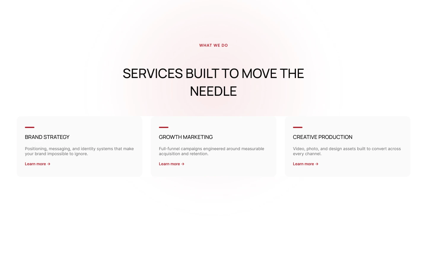 SERVICES & PROCESS
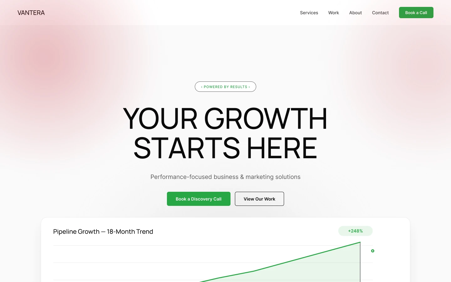 GREEN DIRECTION
Results
- 2 — Accent Directions Explored
- 9 — Homepage Sections