WEBSITE DESIGN · UI/UX Design · 3 weeks · Figma
Ashgrove — Real Estate
Mazain Solution — Senior UI/UX Designer & Design Team Lead, Abdulwahab Khan.
The problem
Premium listings were presented in the same template as entry-level homes, so high-value properties looked indistinguishable from the rest of the catalogue.
The solution
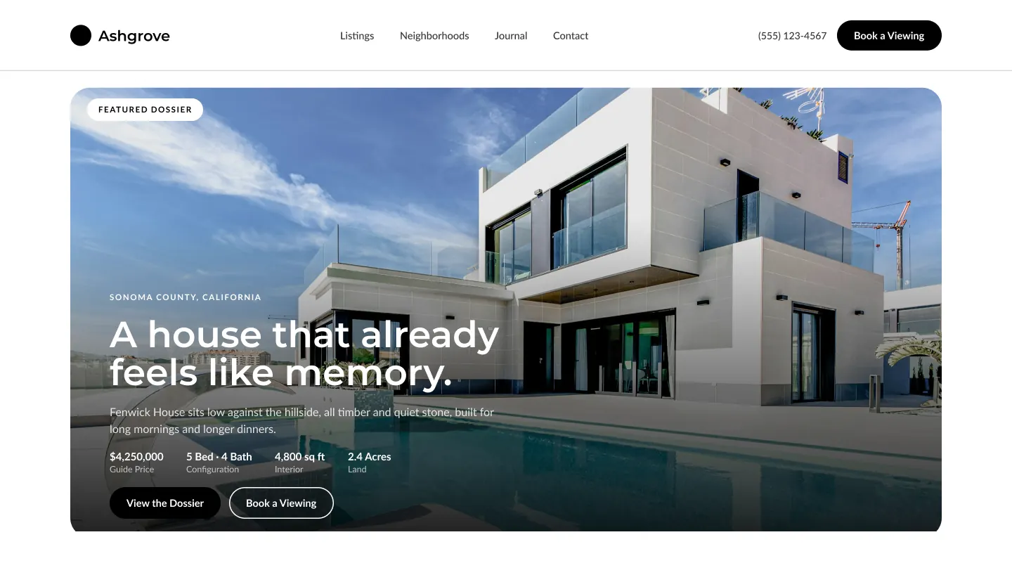
I rebuilt the listing page as a magazine spread rather than a spreadsheet row, letting photography and the property story lead and moving price and specs to a supporting role.
The research
- Reviewed the client's existing listings page by page
- Benchmarked premium real-estate and editorial property sites
- Audited the template for where every listing was forced into the same layout
- Photography was cropped small and treated as a thumbnail, not a selling tool
- Price and specs dominated, so luxury and starter listings read the same
- Neighbourhood context, a major reason buyers choose, had no home in the page
Key insight: High-value buyers respond to atmosphere first and numbers second, so the layout had to sell the place before the spec sheet.
Research board
- 87% — Of home buyers who searched online found photos among the most useful features of Realtor websites (2018 NAR Profile of Home Buyers & Sellers). (RISMedia, citing NAR Profile of Home Buyers & Sellers)
- 70 → 32 days — Average time on market reported for a listing with one photo versus one with twenty (as reported by RISMedia, source Retipster). (RISMedia, citing NAR Profile of Home Buyers & Sellers)
Competitors and inspiration studied
- Sotheby's International Realty — Photography-led luxury listings with editorial storytelling.
- Compass — Image-first search with curated collections.
- Zillow — Data-dense filters and cards: strong for search, flat for premium listings.
What it changed in the design
- Let full-bleed photography lead and move price and specs to a supporting role
- Use an editorial type scale to separate premium from commodity listings
- Add a neighbourhood guide so lifestyle context lives on the page
My process
Audit & Research
Reviewed the client's existing listings and competitor real-estate sites to find where the experience felt generic.
Content-First Wireframes
Structured layouts around large photography and listing narrative before touching visual style.
Visual System
Built an editorial-feeling design system — typography, spacing and imagery treatment — in Figma.
Prototype & Review
Prototyped the listing hero, property detail and neighbourhood guide as one scroll story and reviewed pacing and image weight with the Mazain Solution team.
Design-to-Code Handoff
Delivered a Figma component library with editorial type scale, image-ratio rules and responsive specs to the Mazain Solution engineering team.
Key design decisions
- Photography leads, price follows — Full-bleed imagery sets the tone before any figures appear.
- Editorial type scale — A serif display style separates premium listings from commodity templates.
- A neighbourhood guide section — Gives buyers the lifestyle context that usually sits in a separate brochure.
The screens
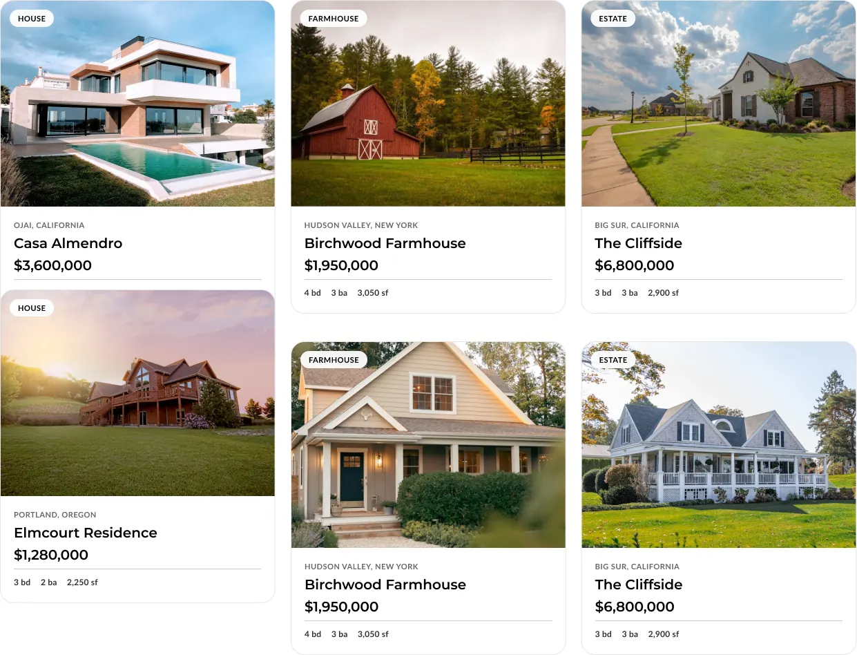 LISTING HERO
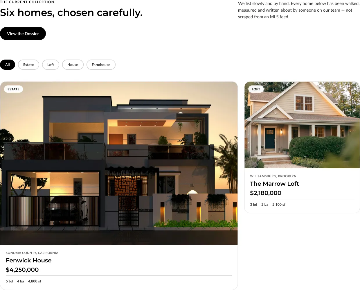 PROPERTY DETAIL
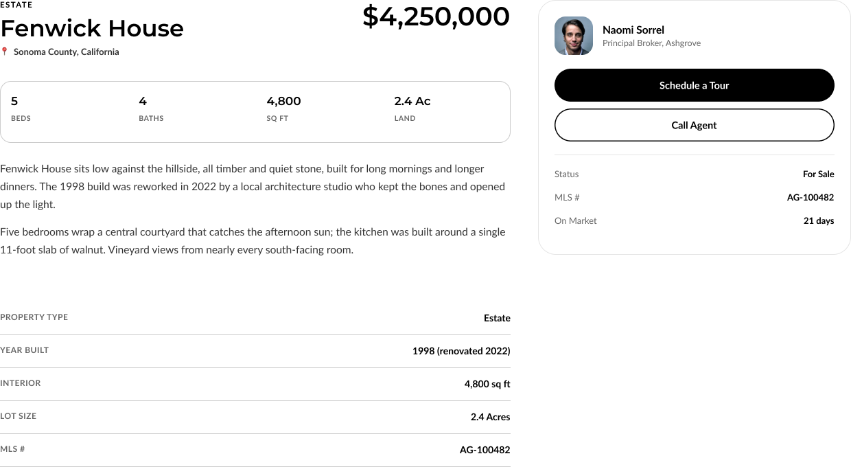 NEIGHBORHOOD GUIDE
Results
- 50%+ — Uplift in Viewing Requests