MOBILE APP DESIGN · Product Design · 14 Screens · Figma
Earnly — Freelancer Payments App
Independent Project — Product Designer, Abdulwahab Khan.
The problem
Freelancers get paid across currencies and clients, and rarely know what has arrived, what is pending and when the next payout lands.
The solution
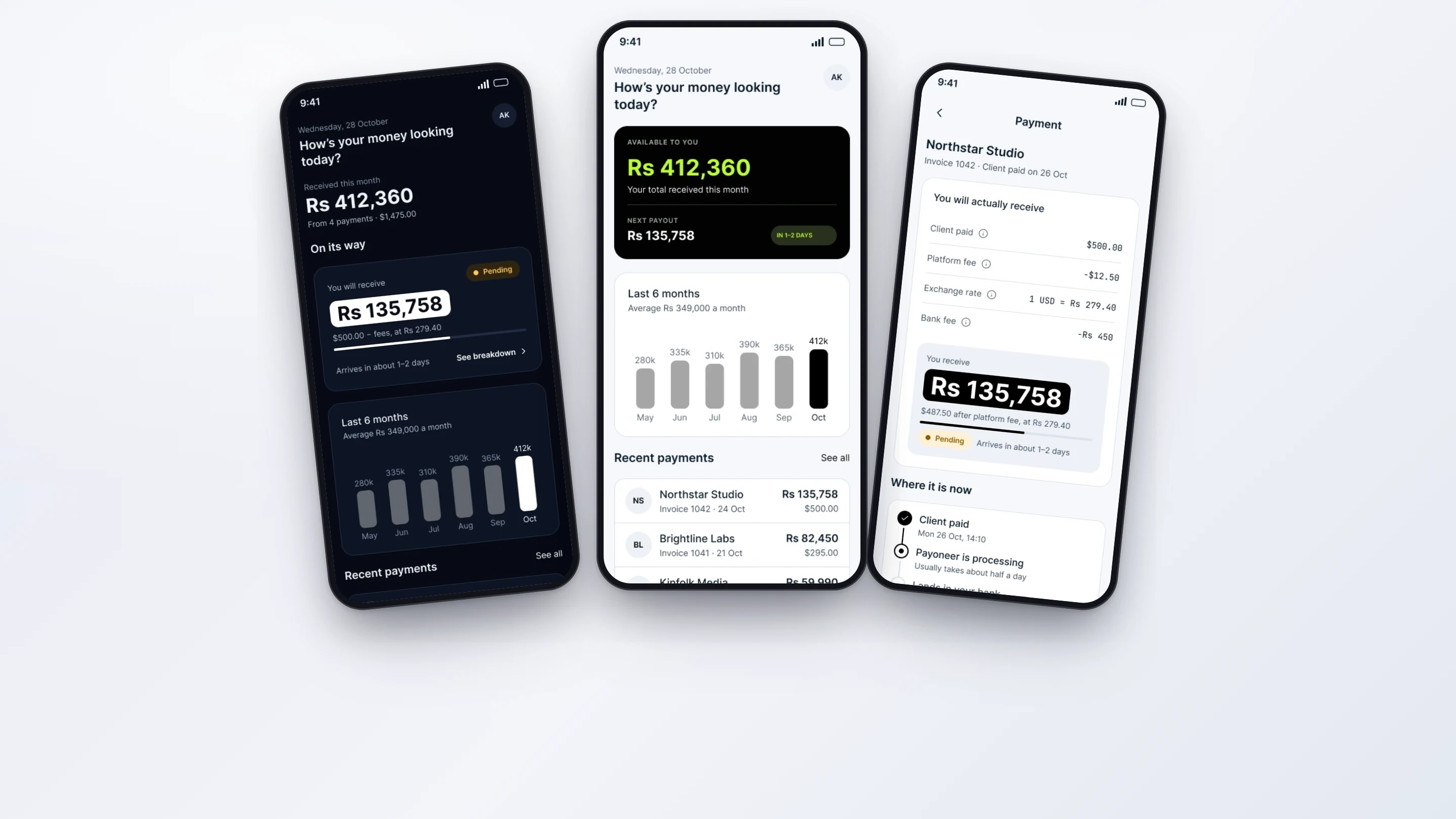
I designed a payments app that answers one question on the home screen — how is my money looking today — with a clear balance, monthly trend and recent payments, plus invoicing in a few steps.
The research
- Compared how freelancer finance and invoicing apps present balances and payouts
- Mapped the life of one international payment from invoice sent to money in the bank
- Listed the questions a freelancer asks about a payment and where each app answers them
- Currency conversion and fees were hidden until the end, so the amount received felt like a surprise
- Pending, processing and paid states were hard to tell apart
- Invoicing apps treated the empty and error states as an afterthought
Key insight: Freelancers don't want a dashboard of numbers. They want one honest answer to 'how is my money looking today?'
Research board
- 82% — Of surveyed US small-business decision makers don't believe their bank is transparent about cross-border payment costs, or aren't sure. (Wise Newsroom, SMB international payments research (2024))
- 49% — Cite complex international payments as an obstacle to expanding abroad. (Wise Newsroom, SMB international payments research (2024))
Competitors and inspiration studied
- Wise — Shows the fee and exchange rate before you send, using the mid-market rate.
- Payoneer — Built around marketplace payouts; costs vary by payout method.
- Stripe Invoicing — Clear invoice states from draft to sent to paid.
What it changed in the design
- Show balance, next payout and trend on screen one
- Break down fees and exchange rate before the amount lands
- Design empty, loading and error states so the app feels finished
My process
Money at a Glance
Put the available balance, next payout and a six-month trend on the first screen.
Invoice Flow
Shortened invoicing to create, preview and send, with a clear payment timeline afterwards.
Light & Dark
Designed every screen in both themes from one set of tokens.
Edge States
Designed empty, loading, error and payment-help screens, not only the happy path.
Prototype & Review
Built a Figma prototype of the invoice flow in light and dark and tested the create, preview and send path for tap count and clarity.
Design-to-Code Handoff
One token set drives both themes. Every component is specified with its empty, loading and error states for a clean Flutter or native build.
Key design decisions
- Balance, next payout and trend on screen one — Answers the core question without a tap.
- Show fees and exchange rate before the amount lands — Replaces surprise with a transparent breakdown the user can trust.
- Designing the unhappy paths — Empty, error and help screens make the product feel finished and reduce support load.
The screens
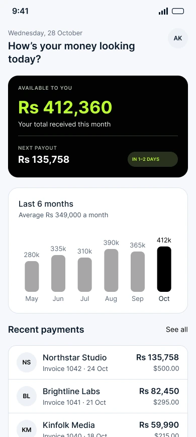 HOME
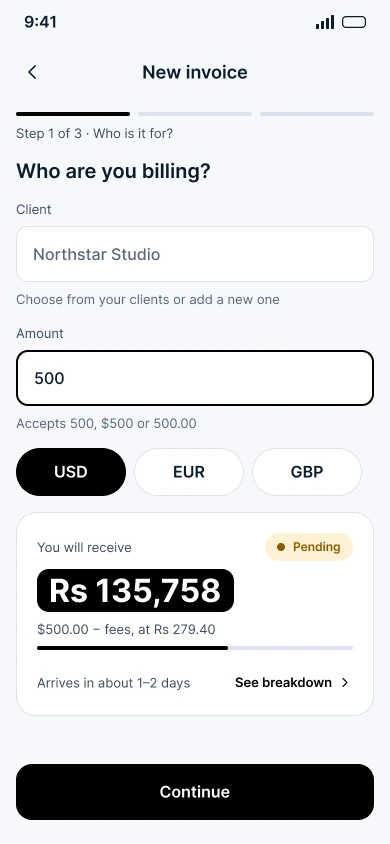 CREATE INVOICE
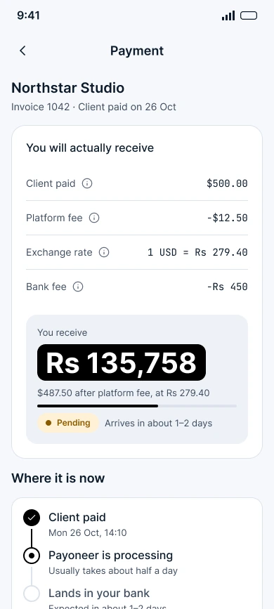 PAYMENT DETAIL
Results
- 14 — Screens in Light & Dark
- 5 — States: Empty, Loading, Error, Help, Success