FINTECH / MOBILE · UI/UX Design · 3 weeks · Figma
Banking App
Mazain Solution — Senior UI/UX Designer & Design Team Lead, Abdulwahab Khan.
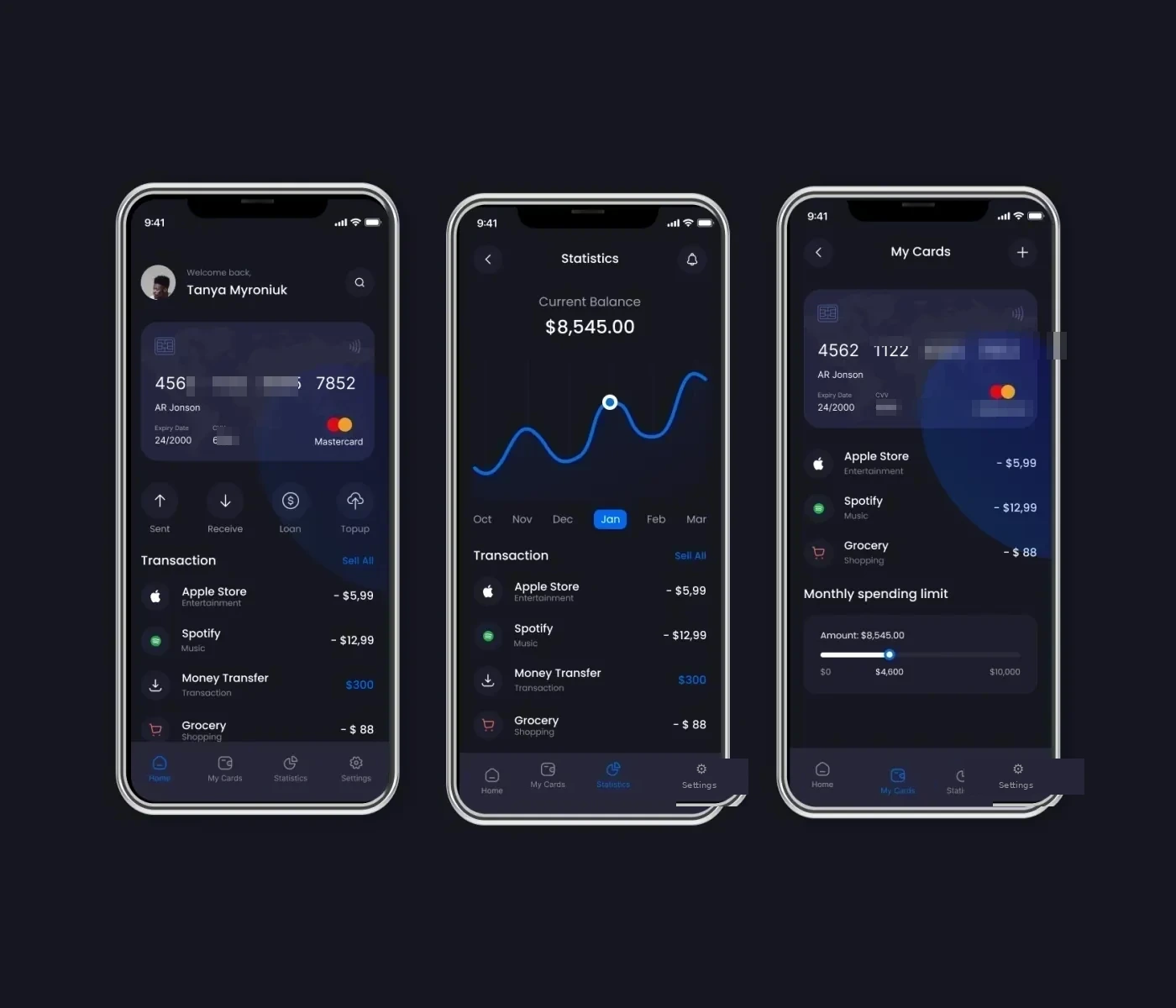
The problem
Users opened the app to check their balance and left more confused, and 'where did my money go?' was the most common source of support questions.
The solution
I designed one clear visual that answers where the money went at a glance, supported by simple send-money, cards and history flows.
The research
- Reviewed fintech UX patterns and accessibility requirements for banking apps
- Benchmarked balance, history and statistics patterns in leading banking apps
- Mapped the send-money flow under time pressure
- Balance and spending were separated, which made money movement hard to read
- Transaction history lacked clear categories and dates
- Sensitive actions needed clear confirmation without extra friction
Key insight: In banking, clarity is a security feature: when people understand their money they trust the app.
My process
Compliance & Research
Reviewed fintech UX patterns and accessibility requirements relevant to banking apps.
Core Flows
Designed and tested the send-money, cards and history flows for clarity under time pressure.
UI Kit
Built a secure-feeling, accessible visual system consistent across all screens.
Prototype & Review
Designed and tested the send-money, cards and history flows in a Figma prototype with a focus on error prevention and confirmation.
Design-to-Code Handoff
Delivered a full component library, accessibility notes and flow documentation to engineering.
Key design decisions
- A spending visual on the home screen — Answers the main question without a tap.
- Cards as a first-class area — Freeze, details and limits live where users expect them.
- Accessible contrast and tap targets — Meets the baseline a financial product owes everyone.
The screens
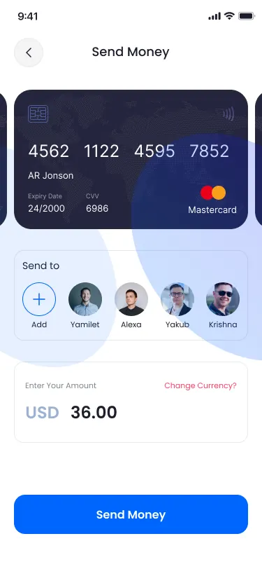 HOME & BALANCE
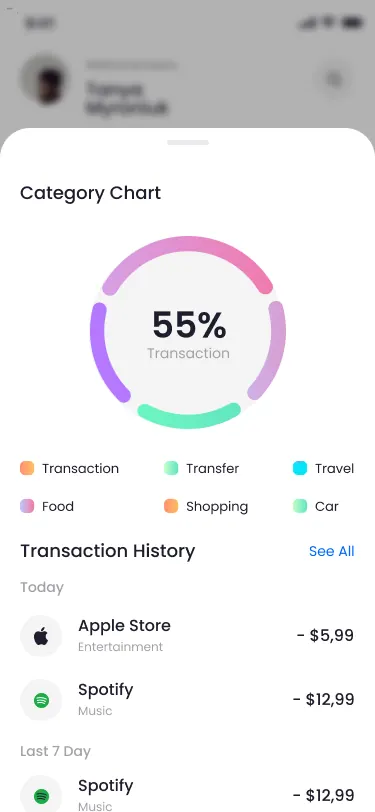 STATISTICS
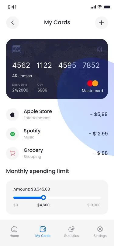 MY CARDS
Results
- 50%+ — Increase in Weekly Engagement