WEBSITE DESIGN · Web Design · Editorial · Figma
Roma & Sonoma — Wine & Travel Journal
Independent Project — UI/UX Designer, Abdulwahab Khan.
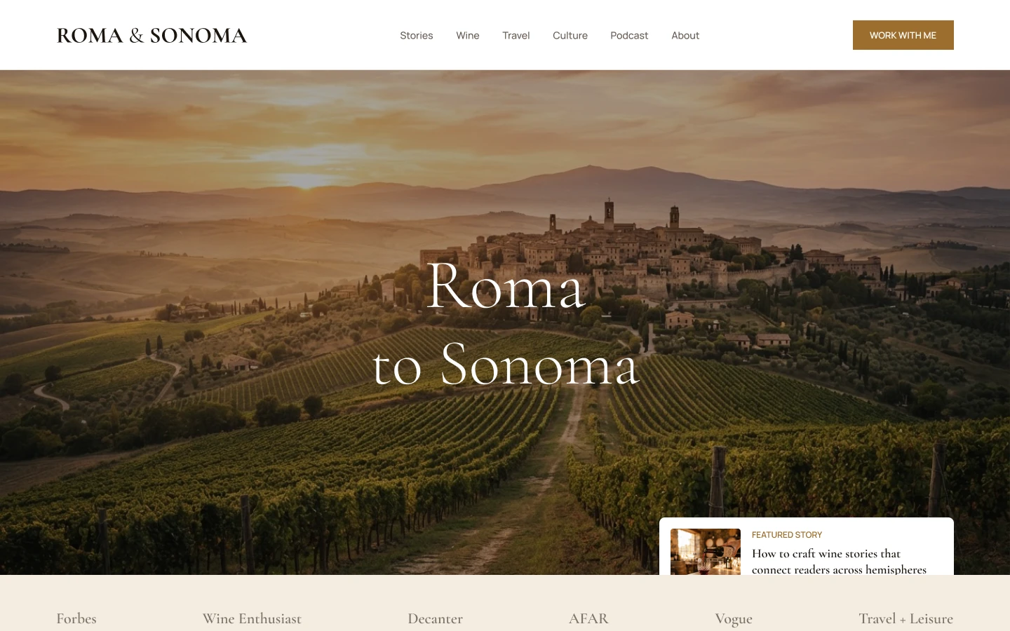
The problem
A writer covering wine, travel and culture needed a site that reads like a magazine, not a blog template.
The solution
I designed an editorial site with a cinematic hero, serif typography and story cards that organise writing into Wine, Travel and Culture, with a clear route to work with the author.
The research
- Reviewed wine, travel and culture magazines for pacing and typography
- Mapped the author's goals: readers, bookings and press
- Audited blog templates to see what makes them feel generic
- Blog templates flatten strong writing into a feed
- Readers pick by interest, not by date
- Press and collaboration enquiries need a clear route
Key insight: An editorial site should be organised by what readers care about, not by when it was posted.
My process
Tone
Chose serif display type and warm earth tones to feel like print.
Content Pillars
Split the site into Wine, Travel and Culture so readers choose by interest.
Page System
Designed home, about, story, portfolio, press kit, map and utility pages.
Mobile
Adapted the layouts for a narrow mobile screen.
Prototype & Review
Prototyped home, story, about and press-kit pages as one flow and checked narrow-screen reading comfort.
Design-to-Code Handoff
Delivered a page system with type scale, card variants and mobile layouts ready for a CMS build.
Key design decisions
- Serif display type with earth tones — Gives the site a printed, magazine feel.
- Three content pillars — Wine, Travel and Culture let readers self-select.
- A visible route to work together — Turns readers into press and brand enquiries.
The screens
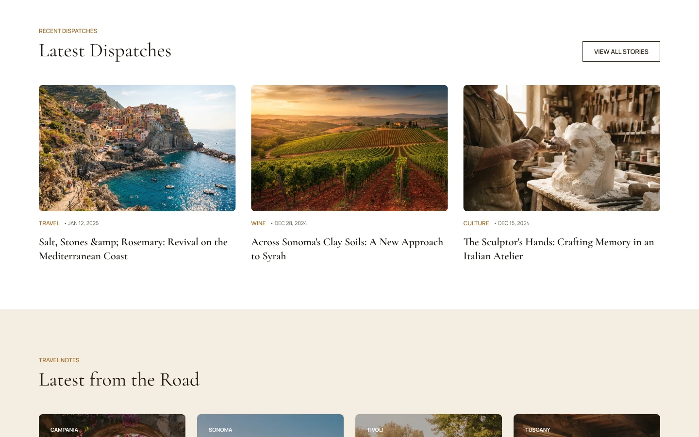 LATEST DISPATCHES
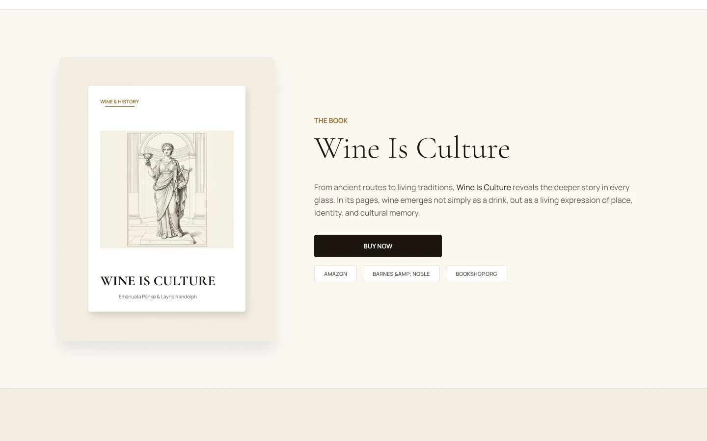 THE BOOK PAGE
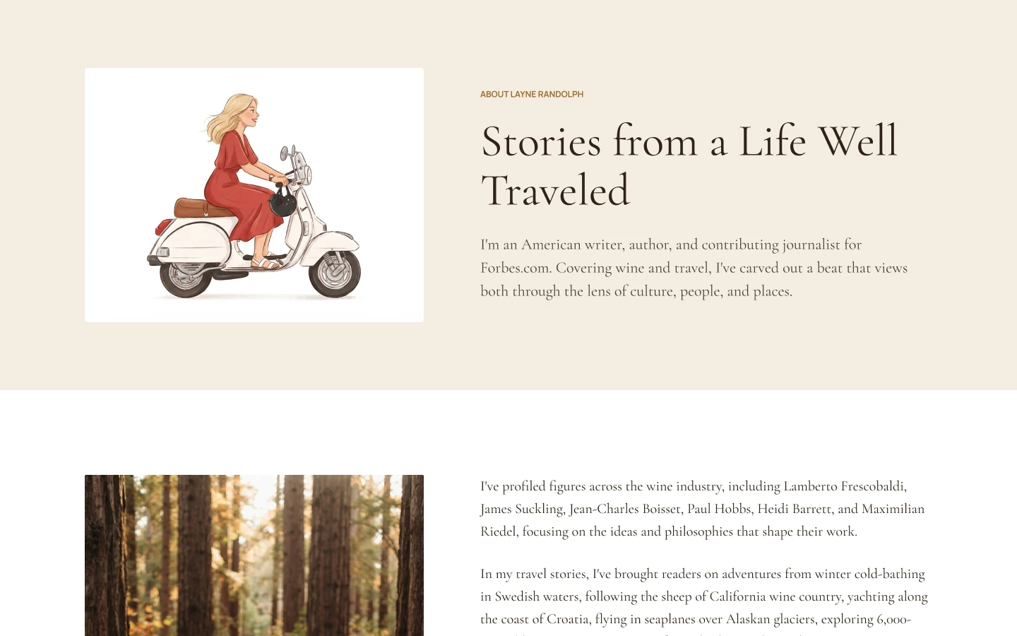 ABOUT THE AUTHOR
Results
- 12 — Pages & Layouts Designed
- 3 — Content Pillars: Wine, Travel, Culture