WEB DESIGN · Web Design · 2 weeks · Figma
Banking Landing Page
Mazain Solution — Senior UI/UX Designer & Design Team Lead, Abdulwahab Khan.
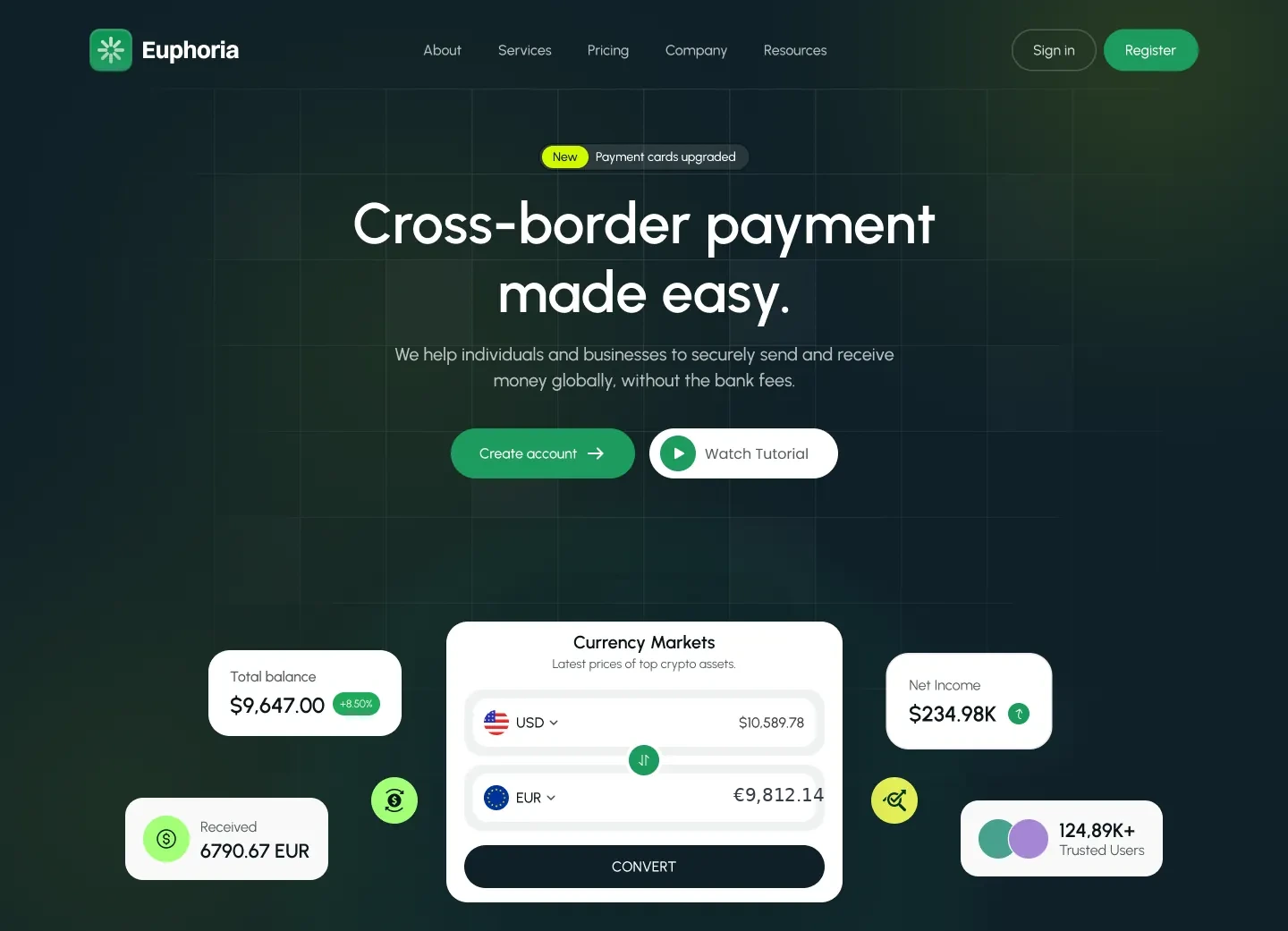
The problem
First-time visitors left quickly: long enough to recognise a fintech landing page, not long enough to trust it with their money.
The solution
I made the product prove itself before asking for a signup, using live-feeling currency cards on the page and trust signals before any commitment.
The research
- Reviewed competitor fintech landing pages for positioning and proof
- Listed the trust signals new users look for before signing up
- Mapped the path from hero to account creation
- Competitors repeated the same abstract claims
- Signup was asked for before the product was shown
- Trust cues like security and rates were buried low on the page
Key insight: New users commit after they see the product work, not after they read a promise.
My process
Positioning Research
Reviewed competitor fintech landing pages to find a distinct, trust-building angle.
Wireframes
Structured the page to lead with trust signals before asking for any commitment.
Visual Design
Designed a calm, confidence-building visual system in line with the brand.
Prototype & Review
Prototyped the hero, currency cards and trust sections to test scroll order and where the signup call to action should repeat.
Design-to-Code Handoff
Delivered dev-ready specs, responsive breakpoints and assets to the Mazain Solution team.
Key design decisions
- Show the product, then ask — Currency cards demonstrate value on the page.
- Trust signals above the fold — Security and credibility appear before the first call to action.
- A calm, confident palette — Signals stability for a money product.
The screens
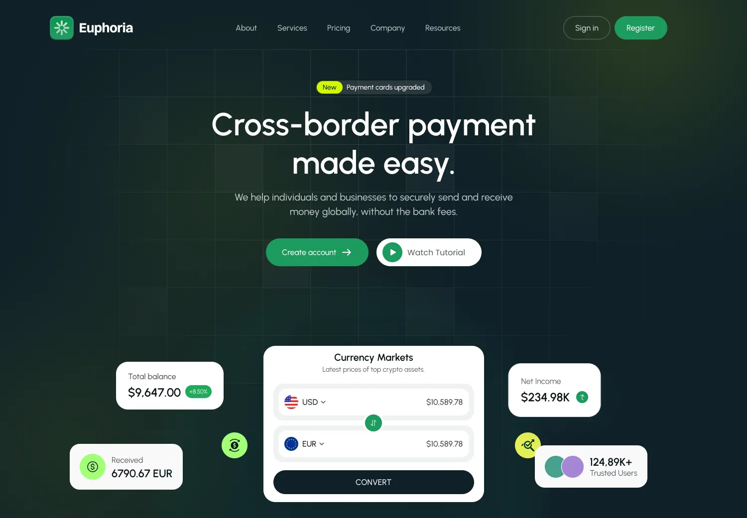 HERO SECTION
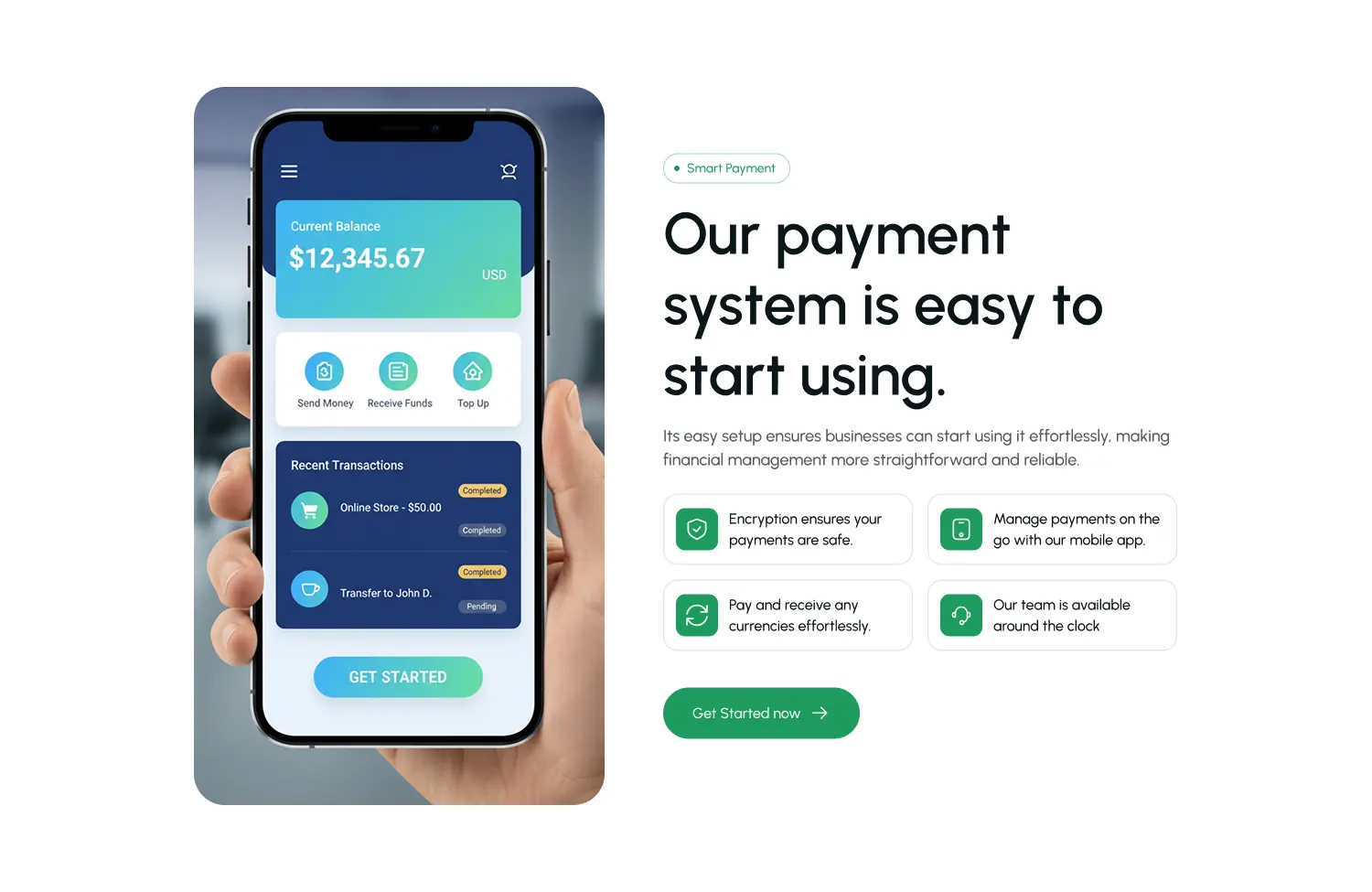 CURRENCY MARKETS
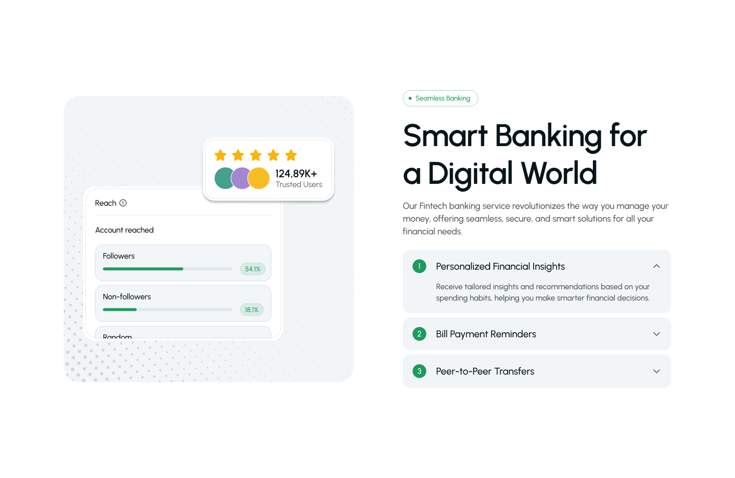 TRUST SIGNALS
Results
- 50%+ — Lift in Signup Conversion