WEBSITE DESIGN · UI/UX Design · 13 Screens · Figma
Mid City Hospital — Care Website
Freelance — UI/UX Designer, Abdulwahab Khan.
The problem
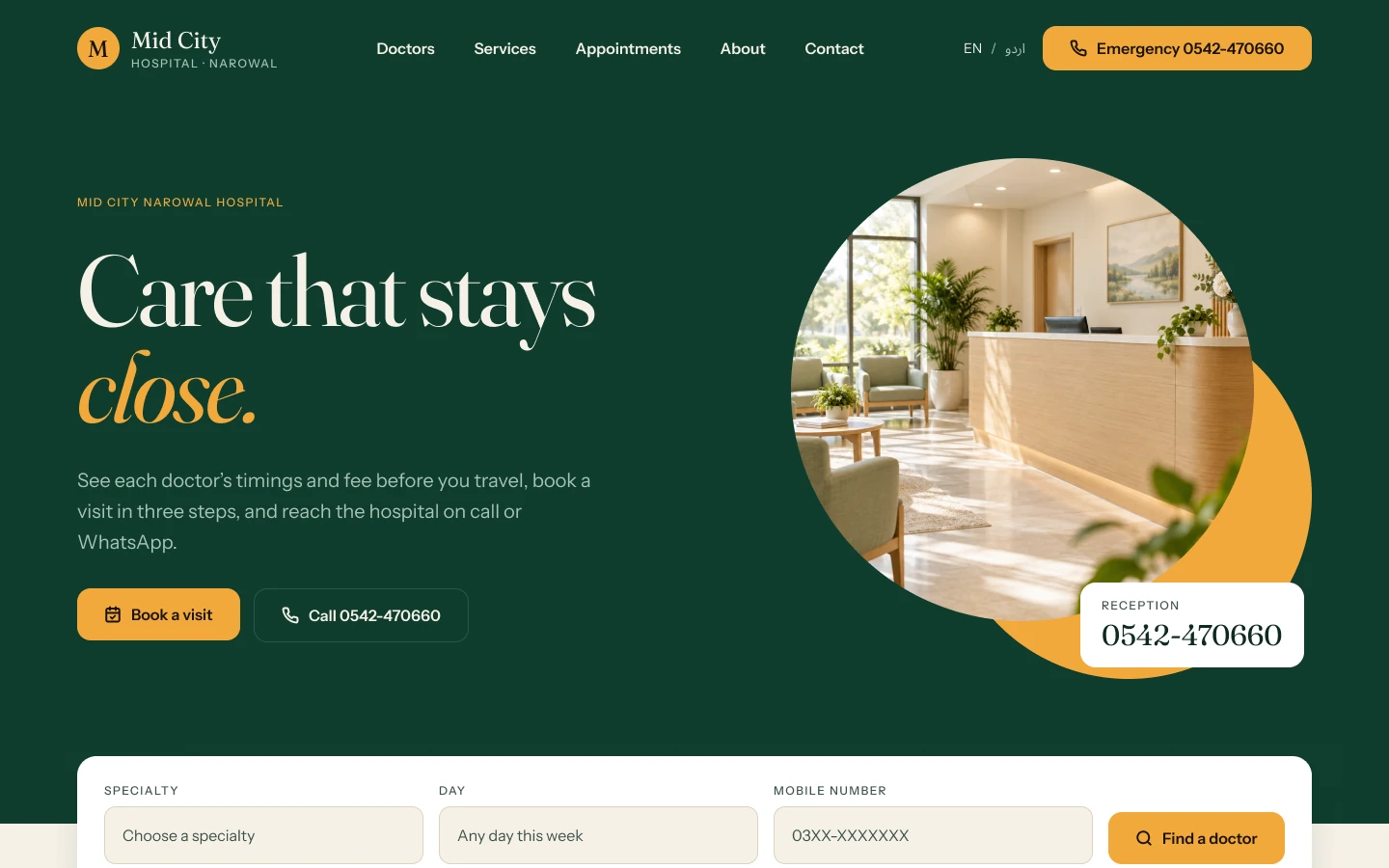
A hospital needed a website that felt calm and trustworthy, while still making doctors, services and booking easy to reach.
The solution
I designed a warm green-and-cream system with large type, clear service cards and health-check packages priced upfront, then carried it through doctors, services, lab reports, appointments, about and contact.
The research
- Reviewed the hospital's services, doctors and contact needs with the client
- Audited nearby hospital sites for tone and structure
- Defined the four reasons a visitor lands on a hospital homepage
- Many hospital sites feel cold and clinical, which raises anxiety
- Emergency, booking and doctor search compete for attention on most homepages
- Health packages are rarely priced upfront, which blocks decisions
Key insight: A medical site should feel welcoming and still make the next step obvious, so tone and hierarchy have to work together.
Research board
- 3 questions — Stressed visitors skim for three answers: right place, trustworthy, what next. (Healthcare Success, Patient-First UX (2026))
- Calm by design — Generous whitespace, high-contrast type, a limited palette with accents reserved for actions, and 'what to expect' content reduce anxiety. (Healthcare Success, Patient-First UX (2026))
- 194M — Mobile connections in Pakistan, about 76% of the population. (DataReportal, Digital 2026: Pakistan)
Competitors and inspiration studied
- Aga Khan University Hospital — Department-led structure that suits a large institution but feels heavy for a local hospital.
- Marham — Doctor-first profiles with fees and reviews.
- Zocdoc — Availability-led booking with clear next steps.
What it changed in the design
- Use a warm green and cream palette instead of clinical white and blue
- Order the homepage around four ways in: book, emergency, doctor, services
- Price health-check packages upfront to remove the phone call
My process
Direction
Chose a calm green-and-cream palette so a medical site feels welcoming rather than clinical.
Content Hierarchy
Ordered the homepage around four ways in: book, emergency, find a doctor, services.
Screens
Designed directory, profile, services, lab reports, appointments, about and contact.
Prototype & Review
Linked the directory, profile, services and appointment screens into one prototype and checked each of the four entry paths reaches its goal in a few taps.
Design-to-Code Handoff
The Figma file is organised page by page, with shared tokens and card components, so development can start from any screen.
Key design decisions
- A warm green and cream palette — Reads as care rather than clinic.
- Four ways in on the homepage — Book, emergency, find a doctor and services cover the real visit intents.
- Prices on health packages — Upfront pricing removes a common reason to phone before booking.
The screens
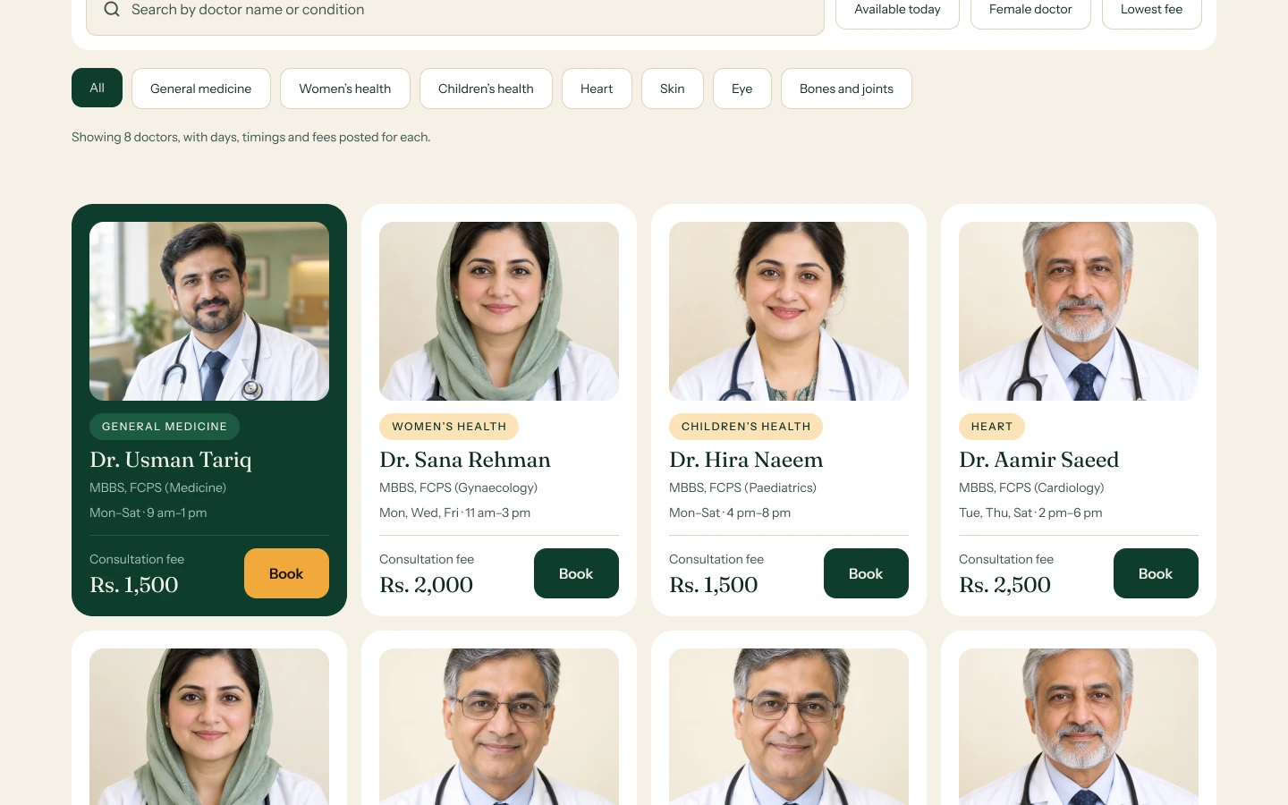 DOCTORS DIRECTORY
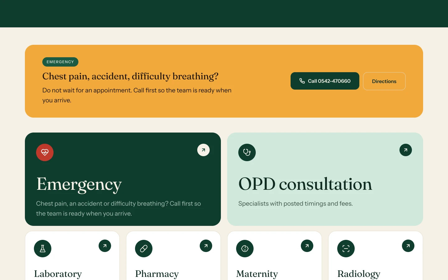 SERVICES OVERVIEW
Results
- 13 — Screens Designed
- 3 — Step Booking Flow