WEBSITE DESIGN · UI/UX Design · Desktop + Mobile · Figma
Safeena Hospital — Care Website
Freelance — UI/UX Designer, Abdulwahab Khan.
The problem
Patients in Narowal had no quick way to see a doctor's timings and fee before turning up, so every visit started with a phone call or a queue.
The solution
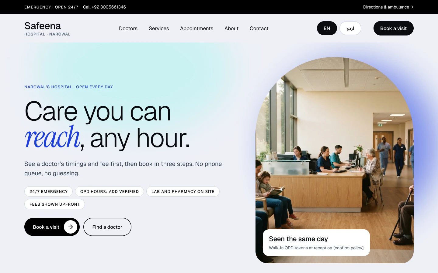
I designed a doctor-first website where the next step is always visible: find a doctor, see timings and fee upfront, and book in three steps with a WhatsApp confirmation — on desktop and a 390px mobile layout.
The research
- Mapped how patients in Narowal reach a doctor today: phone calls, WhatsApp and walking in
- Audited local and national hospital websites for how they show doctors, timings and fees
- Walked the patient journey from 'I need a doctor' to 'my slot is confirmed' and marked every dead end
- Timings and fees were the first thing patients wanted and the hardest thing to find
- Booking meant a phone call or a queue, so people turned up without knowing availability
- Most visitors would arrive on a phone, often from a WhatsApp link
Key insight: Patients search for a person first, then a time. A doctor-first layout beats a department-first one.
Research board
- 194M — Mobile connections in Pakistan, about 76% of the population, so every layout starts mobile-first. (DataReportal, Digital 2026: Pakistan)
- 3 questions — Stressed patients skim for three answers: am I in the right place, do I trust you, and what should I do next? (Healthcare Success, Patient-First UX (2026))
- 1–2 clicks — Finding a doctor, booking and contacting the hospital should each be one or two clicks from the homepage. (Healthcare Success, Patient-First UX (2026))
Competitors and inspiration studied
- Marham — Doctor directory with fees, experience and patient reviews on each profile.
- Oladoc — Specialty search with online booking and video consultations.
- Zocdoc — Search by specialty with available time slots visible before booking.
What it changed in the design
- Put doctor search in the hero and show timings and fee on every card
- Keep booking to three steps and confirm on WhatsApp
- Design the 390px mobile layout in parallel, not after desktop
My process
Patient Journey
Mapped what a patient needs first — who is available, what it costs, how to book — and put it above the fold.
Design System
Built tokens, doctor and service cards and a booking form in Figma so every page stays consistent.
Booking Flow
Reduced appointments to three steps: details, doctor and time, confirm — ending on WhatsApp.
Responsive Layouts
Adapted every key page to a 390px mobile layout, not just shrunk it.
Prototype & Review
Linked the doctors directory, booking and mobile screens into one clickable Figma prototype and walked the three-step booking flow end to end to catch dead ends before handoff.
Design-to-Code Handoff
Design tokens, doctor and service card components and a booking form, organised per page with desktop and 390px mobile variants and spacing and state notes for developers.
Key design decisions
- Doctor-first homepage — The doctor search sits in the hero because it is the first job most patients arrive to do.
- Fee and timing on the card — Showing both in the directory removes the phone call that used to come before every visit.
- Three-step booking with WhatsApp confirmation — Pakistan's default messaging channel closes the loop without asking patients to install anything.
The screens
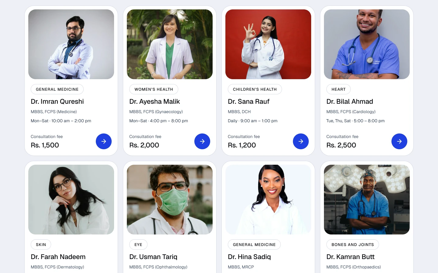 DOCTORS DIRECTORY
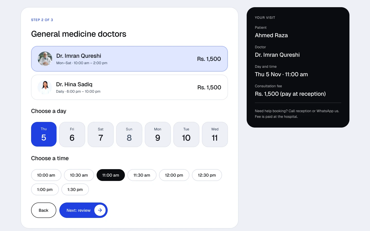 BOOK IN THREE STEPS
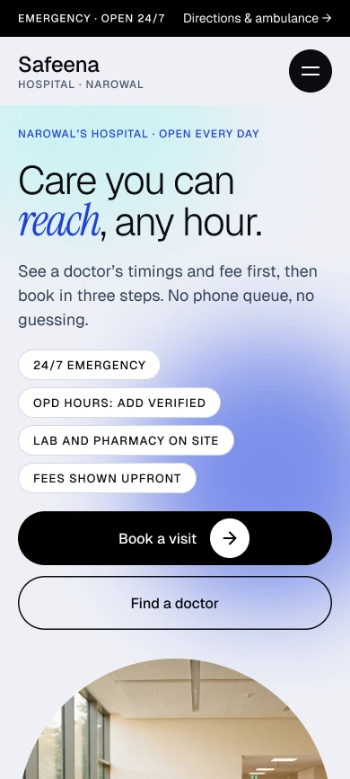 MOBILE HOMEPAGE
Results
- 12 — Desktop Screens Designed
- 11 — Mobile Screens Designed